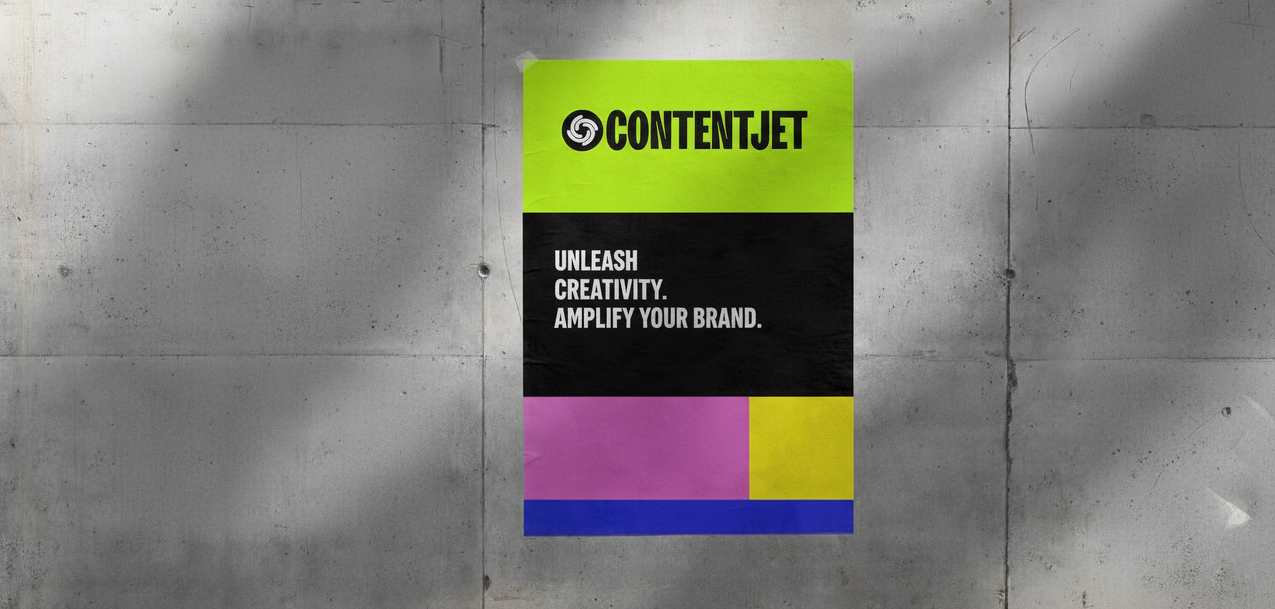
Visual Identity
04.
Typography
4.0
INTRO
“Type is a beautiful group of letters, not a group of beautiful letters.”
- Matthew Carter
Letters are the smallest elements imbued with identity. Typography has the power to transform a graphic piece and define a brand. Although typography can be designed ad hoc, it is also possible to choose from hundreds of pre-designed typefaces and adapt them to our style, layouts, spacing, and uses. In this section, we will cover all aspects of typography: titles, body text, sizes, and compositions.Any typography not included in this document is considered unauthorized.
4.1
Primary Typeface
We use Tomato Grotesk for all headings.
Tomato Grotesk is a modern grotesk with strong contrast and tight spacing that gives our headers serious display power. High contrast, tight spacing and ink traps make it perfect for use in print and on screens in small sizes. When used in large dimensions these features make it an extremely cheerful, versatile typeface.
This isn't your typical corporate font. Tomato Grotesk has personality, the same energy and boldness that defines our approach to UGC. It stands out in pitch decks, commands attention in presentations, and looks confident across all digital platforms.
The geometric simplicity ensures our headings stay readable while the distinctive character reflects our creative edge. Whether we're presenting to Fortune 500 CMOs or scaling campaigns for growth startups, Tomato Grotesk communicates both expertise and approachability.
Typeface
Tomato Grotesk
abcdefghijklmnopqrstuvwxyz
abcdefghijklmnopqrstuvwxyz
1234567890!@#$%^&*()
4.2
Secondary Typeface
For all body text, we use Poppins.
Poppins is a modern geometric sans-serif typeface that has garnered widespread acclaim in both digital and print mediums. It's clean, highly readable, and built for the international audiences our clients serve.
Poppins is a geometric sans-serif typeface published by Indian Type Foundry in 2014. It supports both Latin and Devanagari languages and is available in nine weights, giving us flexibility for everything from case studies to performance reports.
What makes Poppins perfect for performance marketing communication is its clarity at any size. When we're explaining complex UGC strategies or presenting conversion data, readability isn't optional, it's essential.
4.3
Web design Hierarchy
headings
Tomato Grotesk semibold
6.5 rem / 80% / -0.03Rem
Heading 1
Tomato Grotesk semibold
4.9 rem / 90% / -0.03Rem
Heading 2
Tomato Grotesk semibold
4.34 rem / 90% / -0.03REM
Heading 3
Tomato Grotesk semibold
3.9 rem / 98% / -0.03REM
Heading 4
Tomato Grotesk semibold
2.19 rem / 90% / 0%
Heading 5
Tomato Grotesk semibold
1 rem / 120% / 10% / aa
Heading 6
body
Poppins
24 / 150% / 0%
Text Large
At Contentjet, we believe in the power of high-converting content to connect brands with their audiences. Our goal is to deliver performance-focused UGC that drives measurable results across all paid social platforms.
Poppins
20 / 150% / 0%
Text Medium
At Contentjet, we believe in the power of high-converting content to connect brands with their audiences. Our goal is to deliver performance-focused UGC that drives measurable results across all paid social platforms.
Poppins
18 / 150% / 0%
Text Regular
At Contentjet, we believe in the power of high-converting content to connect brands with their audiences. Our goal is to deliver performance-focused UGC that drives measurable results across all paid social platforms.
Poppins
16 / 150% / 0%
Text Small
At Contentjet, we believe in the power of high-converting content to connect brands with their audiences. Our goal is to deliver performance-focused UGC that drives measurable results across all paid social platforms.
Poppins
14 / 150% / 0%
Text Tiny
At Contentjet, we believe in the power of high-converting content to connect brands with their audiences. Our goal is to deliver performance-focused UGC that drives measurable results across all paid social platforms.